Fonts That Don’t Suck: A Designer’s Shortlist for 2026
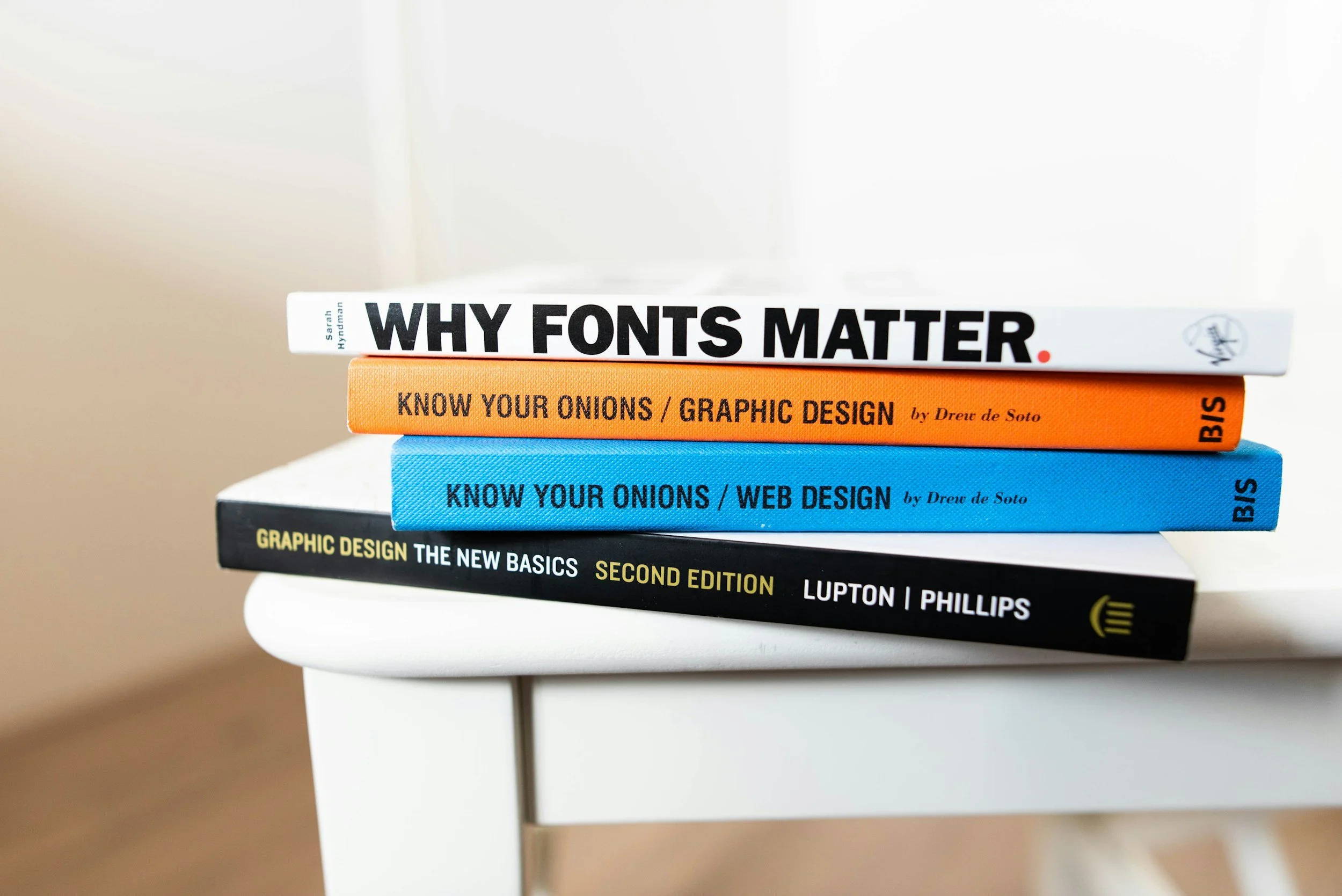
Let’s be real: fonts can make or break your brand. They’re not just letters on a page — they’re the vibe, the energy, the first impression. A killer font makes your brand look polished, intentional, and trustworthy. A bad font? It makes you look like you designed your website in a middle school computer lab. (Looking at you, Comic Sans.)
As we roll into 2026, font choice matters more than ever. With attention spans shorter than a TikTok and design trends shifting fast, the typefaces you choose will either elevate your brand or drag it straight into the “meh” pile. Here’s our shortlist of fonts that don’t suck — fonts that will keep your brand looking modern, bold, and scroll-stopping.
1. Chunky Sans Serifs
Think bold, thick, unapologetic letterforms that scream confidence. Fonts like Monument Extended or GT America Expanded are perfect for brands that want to stop the scroll with a headline that feels larger than life. They work great in hero sections, ads, and graphics where you need instant impact.
2. Editorial Elegance
On the flip side, high-contrast serifs are having a moment. Fonts like Canela, Tiempos Headline, or Editorial New bring an old-school sophistication with a modern twist. They’re perfect for lifestyle brands, boutique agencies (hi, us), or businesses that want to ooze luxury without looking dated.
3. Retro Groovy Throwbacks
The 70s are still alive and kicking in design. Fonts with playful curves, funky swashes, and bold personality are showing up everywhere in branding. Think Cooper BT or funky custom scripts. These fonts are best in small doses — a logo, a headline, a product label — not an entire website. Otherwise, you risk looking like a parody.
4. Sleek Minimalist Sans
Sometimes less is more. Clean, geometric sans serifs like Circular, Sofia Pro, or Inter are timeless and versatile. They’re perfect for body text, navigation, or any space where you want your content to feel effortless. The trick is pairing them with something bolder so you don’t veer into boring.
5. Hand-Drawn & Human Fonts
In an era where AI can spit out a perfectly sterile typeface in two seconds, people are craving fonts that feel handmade. Think quirky scripts, brush lettering, or imperfect sans serifs that look like a designer had fun making them. Great for brands that lean into authenticity, creativity, or community vibes.
6. Variable Fonts
Nerdy but cool: variable fonts let you adjust weight, width, and slant in one single font file. This means more flexibility, better load speeds, and endless possibilities for custom branding. In 2026, we’ll see more brands embracing variable fonts not just for function, but as a creative flex.
Font Crimes to Avoid in 2026
Comic Sans. It wasn’t funny in 2002 and it’s not ironic now. Stop.
Papyrus. Unless you’re making a parody of Avatar, don’t even think about it.
Overused Free Fonts. Yes, Google Fonts are convenient, but if your brand is using the exact same typeface as 20,000 others, you’re blending in. Invest in licensing something unique.
Too Many Fonts. More than 2–3 fonts in one brand? It’s chaos. Keep it simple, keep it consistent.
How to Pick Fonts That Actually Work
Match the font to your brand personality. Bold sans = confident. Script = creative. Serif = elegant.
Test legibility across platforms. If people can’t read it on mobile, ditch it.
Pair fonts thoughtfully. Balance bold with minimal, fancy with simple.
Think long-term. Trends are fun, but your font choices should hold up for years, not months.
The Bottom Line
Fonts aren’t just decoration — they’re identity. Pick the wrong ones, and your brand feels amateur. Pick the right ones, and you look intentional, stylish, and credible. In 2026, the fonts that don’t suck are the ones that tell your story with confidence and clarity.
👉 Want your brand to look as good in type as it does in strategy? Work with Ivy House Creative and let’s give your brand a glow-up that even Helvetica would envy.


