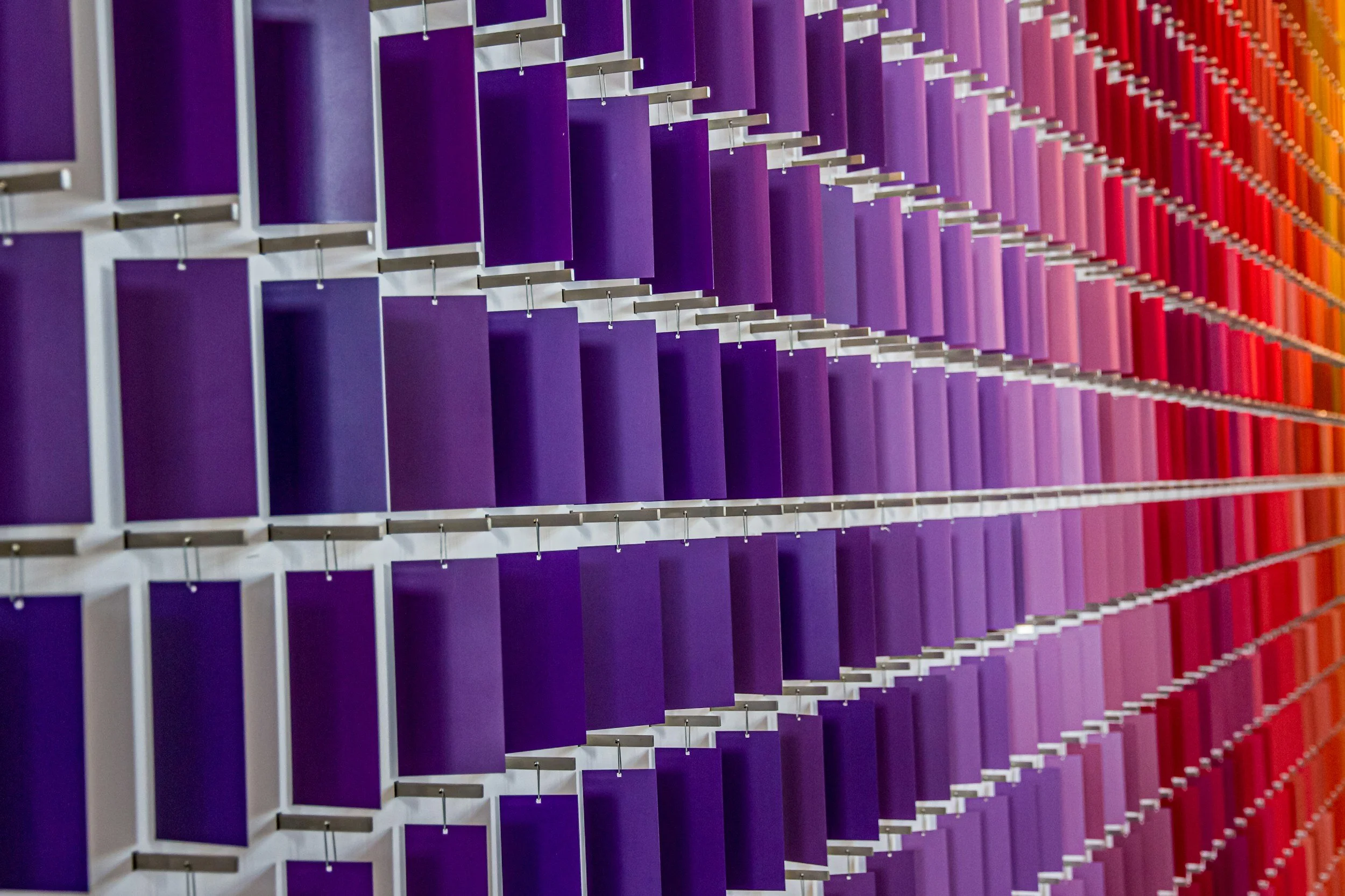
Color Palettes We’re Crushing On for 2026
If branding had a dating profile, color would be the first swipe. People might not consciously remember your logo or tagline, but they’ll remember how your colors made them feel. And if your palette is giving “beige accountant office,” you’re already losing eyeballs. Color is the fastest way to signal personality, set the vibe, and make your brand unforgettable.
So what’s hot for 2026? What palettes will make your brand feel modern, magnetic, and scroll-stopping — and what color choices will make you look like you’re stuck in 2012 Pinterest hell? Let’s dive into the palettes we’re absolutely crushing on.
1. Vibrant Botanicals
Nature-inspired, but not the muted sage-and-taupe you’ve seen a million times. Think lush emerald greens, tropical teals, saturated oranges, and bold magentas. This palette screams growth, creativity, and “we’re alive, dammit.” Perfect for wellness brands, lifestyle businesses, and anyone who wants to feel grounded yet vibrant.
2. Cyber Candy
Neon pink, electric blue, ultraviolet purple, lime green — basically, if it glows under a blacklight, it’s in. Gen Z has zero patience for boring, and Cyber Candy palettes feel like the future of digital culture. Great for e-commerce, entertainment, or any brand that wants to feel unapologetically bold.
3. Luxe Minimalism
Clean neutrals layered with metallic accents. Think charcoal and cream paired with bronze, rose gold, or deep gold foils. This palette whispers “expensive” without trying too hard. Perfect for law firms, financial services, or boutique luxury brands who want sophistication without stuffiness.
4. Dopamine Brights
Marketing in 2026 is all about vibes, and dopamine palettes deliver pure joy. Juicy reds, sunny yellows, cobalt blues, bubblegum pinks. It’s maximalist, playful, and meant to make people smile. If your brand thrives on high energy and community, dopamine colors are your new best friend.
5. Moody Monochromes
Sometimes the sexiest move is sticking to one color and exploring its shades. Deep navy paired with soft sky blue, burgundy layered with blush, olive offset with lime. Monochromes feel sleek, professional, and editorial. They’re also wildly versatile across digital, print, and product packaging.
How to Pick the Right Palette (Without Losing Your Soul)
Here’s the catch: you can’t just pick what’s trendy. If your brand personality is warm, approachable, and earthy, Cyber Candy will feel like a bad Halloween costume. Your palette has to match your vibe. Ask yourself:
What do I want people to feel when they see my brand?
What colors naturally attract my ideal audience?
Can I actually use these colors consistently across all platforms without looking like a circus?
What to Retire in 2026
Sorry, millennial pink. We loved you, but you’re officially tired. Same for muted sage green + beige combos — they’ve been done to death. If your brand is still hiding behind safe neutrals, it’s time for a glow-up.
Why Color Matters for Conversion
This isn’t just about pretty vibes. Color psychology is real. Red creates urgency (great for CTAs), blue builds trust (law firms love it), green suggests growth (perfect for eco or wellness brands), and yellow sparks optimism. Picking the right palette can literally boost clicks, conversions, and customer loyalty.
The Bottom Line
In 2026, your brand can’t afford to be forgettable. Your color palette is your first impression — your handshake, your outfit, your vibe. Go bold. Go intentional. And for the love of branding, stop hiding behind beige.
👉 Want a brand identity that turns heads in 2026 (instead of putting people to sleep)? Work with Ivy House Creative and let’s paint your brand in colors people can’t ignore.